Home Photo Tutorials Video Tutorials Gallery Creative Resume Permissions Email Me

Faux Metal Tutorial

This was so much fun!!! My page titled The Journey (above this tut) features this faux metal. Here are the supplies you'll need...

Read More

Crepe Paper Carnations

How much do I love thee? Let me count the ways!! Isn't this flower adorable!? I ran across this tutorial on the web months ago and it has been rolling around my head ever since. It is so versatile making it perfect for every one one of your gorgeous creations. Let's go!

Read More

Calla Lily

I fell in love with this flower when I saw a video for it on the Heartfelt Creations website. So, if you don't want to read my tutorial you can click here to watch it over at HC. I did distress this up a little bit, which is not on the video. All right! Let's get started......

Read More

Faux Leather Tutorial

Making faux leather is easier than you think. I know, I say that about a lot of my tutorials. Have I been wrong? LOL...

Read More

Snowy Poinsettia

These flowers are just too cute! They are beyond easy to make too...BONUS!

Read More

Emerging Color Stamping Technique

Ok, I'll admit it...I really love stamping and the more I stamp the more I want to stamp. It's a wonderfully vicious circle. Emerging Color is one of those techniques that have some very basic and constant elements to it, but the creative license is all yours in how you present it. I'm sure if you Google or YouTube you will find a ton of tutorials and a lot of them will be very similar. Emerging Color boils down to this one word: resist. This is at its very core a resist technique. The whole trick to doing this is to remember that you will work in layers.

Read More


Monday, January 31, 2011

Swirlydoos SGC Challenge - Arches


How do I love thee, let me count the ways.  I am hosting a challenge at Swirlydoos this month. No page layouts, or ATCs!  Those who enter have to create something using an arch.  I've posted arch templates, and created a tutorial for Swirlydoos that shows you how to make these gorgeous glass flowers.


There are a few rules for the challenge.  Your arch must be 6 inches high, you have to use at least 50% Swirly goodies, you have to use at least one piece of Dusty Attic, or a chipboard equivalent (if there is such a thing) LOL.  I will give an extra point for each glass flower.  My examples are simple but that is because I want everyone to see how pretty these can be without going crazy.


The whole point of this challenge is to try something new.  If you have been wanting to try a new technique, a new product....this is the time to do it!  Most importantly, the point is to have fun.  Come on over to Swirlydoos and join in the fun!!!


Thanks for stopping by!
XO,
Lisa

Sunday, January 30, 2011

Swirlydoos Sneak Peak in Honor of CHA

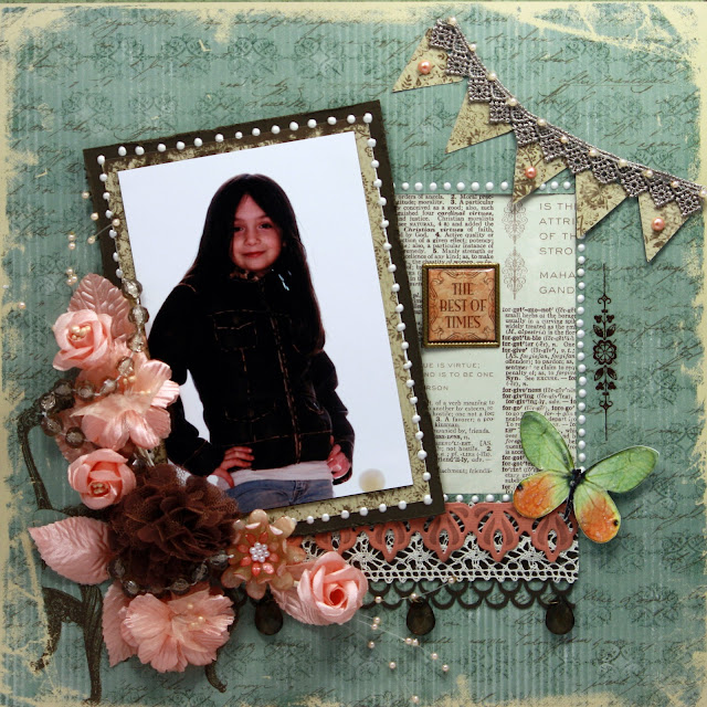
Over at Swirlydoos, we thought we would give some sneak peeks "CHA style" at the soon to be revealed February Kit - Things Remembered.  This kit is full of paper from TPC Studio.  It is their Grandmother's Attic line.  The colors are so rich and saturated.  Lots of blues, browns and peaches; and most of them have a beautiful antique and distressed feel to them.

This page took on a life of its own.  I tried to lift a page from Robin and it went horribly wrong. LOL  Ever have that happen? 

I'm going on record right here and letting you know that I am not a big fan of banners.  I've seen them on a lot of pages and only a few of them caught my eye.  I decided to dress mine up with pearls and lace.


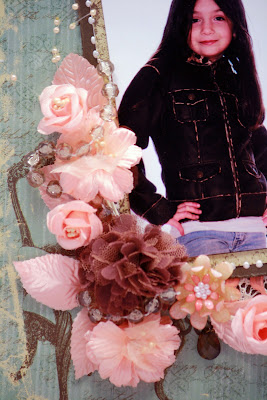
This is a close up of a glass flower I made.  I will be doing a tutorial for Swirlydoos so you should check it out!  They are surprisingly easy to do!


Krissy threw in a few strands of glass beads into our kit this month, and rather than sacrificing them like I normally would, I kept them in tact and wrapped them around my flowers.

I hope you have enjoyed this sneak peek.  To see the other peeks from the rest of the Design Team, head on over to Swirlydoos and check it out!

Thank you so very much for stopping by today!
XO,
Lisa

Saturday, January 29, 2011

A face lift for my blog

I am happy to unveil my new blog!!  Let me just say that Casey at HotBliggityBlog is nothing short of uh-mazing!!!  She is sooooooo good at what she does and was so very patient with my crazy questions and little tweaks here and there.  LOVE YOU CASEY!!!!!

Let me take you on a short tour!  At the top is a menu.  You can see that I have a link for a Tutorials page.  Here you will be able to find all of my tutorials at the click of a button!  I will also begin building my galleries so keep checking back to see what I've done.  My life coach LOL, and dear friend Robin Shakoor, has talked me into building a scrappy resume.  BTW, Robin turned me onto Casey!  Thanks sweetie!  You can also email me if you have a question.  Cool, huh?!

I'm really excited about my slider bar at the top.  Right now I have my tutorials featured but will be mixing that up as I go along.  I also love the boxes over on the right side that have tabs in them.  Check them out! The second box has a section of my own creation called Neighborhood News.  I am so proud of my scrappy sisters and when they have exciting and great things happen I want the whole world to know.  This section is dedicated to my friends and all of their accomplishments.  Without all of you, this craft of ours would be a very boring place!  Love you XOXOXO

Another tab is titled Challenges.  I am going to be posting some challenges that I am hosting, a few challenge sites that are run by friends of mine as well as blog hops.  My archives and favorite blogs can be found under these tabs as well.

I hope you like my new diggs!!!!  Thanks for stopping by!

XO
Lisa

Monday, January 24, 2011

March Calls have been posted....

The March Calls for Scrapbook News and Review Magazine have been posted!!!!  Hop on over there and check it out!!  Click HERE

Check out the new issue too!!!!!!!

Friday, January 7, 2011

Faux Leather Tutorial


Making faux leather is easier than you think.  I know, I say that about a lot of my tutorials.  Have I been wrong? LOL  Let's get started!


Supplies

  • Matte Multi Medium
  • Paint Brush
  • Card Stock
  • Tissue Paper
  • Ink (I used Distress Inks in the following colors: Old Paper, Vintage Photo, Walnut Stain and Aged Mahogany
  • Ink Blending Tool (s) & Pad (s)

Step 1
The first thing I did was distress my paper by using my fingers to break down the paper fibers so that the paper was more flexible.  I didn't really do this for the creases because the tissue paper takes care of that.

Beginning with your lightest color, start pulling the ink onto your paper with your blending tool.  Remember that you want an uneven finish.  Old, worn leather doesn't have an even color, neither should your card stock.

*Tip - Don't get stuck in the thought that your leather must be brown.  Get creative and go with any color your heart desires.  I used to have a pink leather mini skirt.  LOL Those were the days.

Step 2
Once you have your card stock inked to your heart's content, take a piece of tissue paper that is half-again as big as your card stock, and crumple it up really good.  I balled mine up into my hand.  Now gently pull it open, but don't open it to the point where all of your wrinkles and creases are gone.


Step 3

Using your paint brush, begin spreading your matte Multi Medium onto your card stock until you've covered it.

**Tip:  If you are using Distress Ink, it will begin to react to the moisture from the Multi Medium.  If you look close at my photo you can see where this is beginning to happen.  Now, you may decide you want this to happen in which case it gives you another opportunity to blend and move the color around.  If you don't want this to happen then you need to use as few brush strokes as possible to get your piece covered.  I started out using more MM on my brush so that my brush wasn't initially in contact with the paper.  You can eliminate this from happening by using inks that don't react to water.


Step 4

Take your tissue paper and begin laying it onto your paper.  This is where you control how wrinkled and creased your leather looks.  You can just lay it on top all at once and lightly press it down in place, as I have above), or you can start in one section and using your fingers you can pull open your tissue paper so that it isn't so wrinkled and push it down onto your page. (Refer to my page layout example at the top)  You can go another step further and move the tissue paper around on the page.  Just remember that your tissue paper is soaking up moisture and could rip or tear.

If you have any tissue paper hanging over the edge just leave it there for the time being.  You'll need to dry your project at this point by using a heat gun or hair dryer.  Once the paper has dried, use a craft knife or scissors and trim off the excess tissue paper.


Step 5

Take your mid-tone ink (Vintage Photo in my case) and run your blending tool just across the tops of the creases so that they grab the color.  You may want to smoosh your tool down in a few places to add a richer tone to your leather.  

Your Done!!!!  As you can see from the two examples I provided at the beginning of this tutorial, the applications are only limited by your mind.  You could make an entire background out of this, a card or just sections for a page.  You could make inches, twinchies, thrinchies, tags and ATCs.  You can stamp on it (as I did above).  I used colored pencils on the example as well.  Open your mind and get creative.  I can't wait to hear how this works for you and I would love to see what you do with it!

Have a blast and thanks so very much for stopping by!!
Saturday, January 1, 2011

Swirlydoos Reveal Day!!!! Introducing Retro Tapestry!!!!

Oh Baby!!!!  January's kit is vibrant and gorgeous!  This month's kit combines paper from Glitz and GCD Studios, flowers from Petaloo, the add on kits include ribbon and trim, chipboard wings and hearts and SO MUCH MORE!!!!  You may notice that I rarely used ink on these pages *gasp*!  It's true!!  The paper is so fresh, funky and colorful that I wanted it to stand on it's own.

I call this page Lakeside Dreaming.  My DD and her cousin about 5 years ago.  We were staying at a friend's camp on Lake Ontario.  They were sitting on this giant rock sticking out of the water and it just begged to be snapped with my camera.  I decided to distress my paper by ripping and using water.  No ink involved. I added a piece of Dusty Attic that I used some Liquitex ink and a pinch of Diamond Dust glitter on it.  I wanted it to stand out so I strategically placed some card stock behind it.  I also used the chip board hearts that came in my lovely package.  I dabbed on some white paint and while it was still wet I dropped them into a pile of lemon yellow glitter that also came in the kit.  I added some stamping and pearls along with some gorgeous butterflies to finish it off.


I did this page for the monthly sketch that comes in the kit.  I used one of my favorite Donna Salazar stamps.  Click Here to go and see it.  If you never tried her stamps, you really should.  They are gorgeous in their detail. I filled in the flowers with some Liquid Pearls that came in the kit, and edged my scalloped paper the same way.  Isn't the frame at the bottom HOT?!  


This is my attempt at using a clean and simple style.  LMBO!!!  It's not really clean and simple, but it is for me. This paper is really, really pretty in person.  I used PSE8 to change my photo to a high contrast black and white and I added texture to it as well.  It was just begging to be used with this paper and I didn't want to take away from the light, airy and fluid motion of it all....so I attempted to keep it simple. (BTW, I'm still laughing.)   I added a rub on next to my photo and decided to use one of my stencils.  This page is really different for me, sort of, but I really like it.


The Design Team was asked to create a masculine page with what would ordinarily be considered a feminine kit.  This is what I came up with.  See....it is totally possible to create a "guy page" using this kit, or any other one for that matter.  When I told my DH that we were asked to make a guy page from a Swirlydoos kit he made the funniest face.  He said "No way you are going to take a picture of mine and put it on a girlie page!"  For the record, he was pleasantly surprised when he saw the finished product.  He smiled, a lot!  Yay!!!  The paper, flowers, Curiosities tag and phone dialer came with the kit.  I used some of the coordinating card stock and created the faux leather background behind the photo.  I also used Fimo Clay to make the faux leather tag as well.  I will be putting together tutorials on that for you this weekend.  It is painfully simple and you will LOVE it!  Promise!


Thanks a ton for stopping by on reveal day!!  If you haven't signed up for the kit club, or have been on the fence about it, let me just say that you won't be disappointed.  The forums and ladies that call Swirlydoos home are the best around.  
I hope you all have a tremendous 2011!!!  Thank you for your past support and for your comments.  I appreciate them from the bottom of my heart!